How Fabric Colour Changes the Way Thread Colours Look
By Melanie & Dominique
One of the most fascinating things about embroidery, and something many stitchers discover over time, is that thread colours never exist in isolation.
They are always influenced by the colour around them.
The fabric you choose can completely transform how a thread appears once it is stitched.
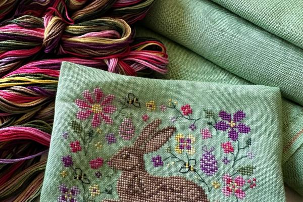
And this is exactly what happened while we were developing the Spring Hare design for the March/April Broderie & Colour Box.
When Colours Don’t Behave the Way You Expect

When we begin designing a piece, colours are carefully chosen so they balance each other and bring the design to life.
But embroidery has a small secret:
A colour that looks perfect on paper or on a neutral fabric can behave very differently on a coloured linen.
For the Spring Hare design, we chose a beautiful spring green linen that perfectly captured the feeling of the season, fresh grass, new leaves and the return of nature after winter.
However, once the stitching began, something wasn’t quite right.
The original thread colours simply didn’t shine on the green fabric the way we had imagined.
Some colours appeared duller, others blended too much into the background, and the overall design lost some of the vibrancy we wanted.
So the unpicking began…
Back to the Drawing Board (Twice!)
In fact, the hare had to be unpicked and stitched again twice before the colours finally felt right.
It’s a part of the creative process that most people never see, but it happens more often than you might think.
Changing the fabric colour means that every other colour in the design needs to be reconsidered.
What works beautifully on white linen may not work at all on green.
The Power of Complementary Colours
The solution came from colour theory.
Because the fabric was green, we needed colours that would stand out against it rather than compete with it.
In colour theory, the complementary colour to green is pink and its neighbouring shades.
By introducing these tones into the design, the colours suddenly came to life.
The pinks created contrast against the green background, while still keeping the soft, spring atmosphere we wanted.
At the same time, the more neutral tones of the hare were adjusted slightly so that he remained the focal point of the design.
Why Fabric Colour Matters
This experience is a wonderful reminder that embroidery is not only about the thread colours themselves, but also about the relationship between colours.
Fabric acts as the stage for the design.
It influences:
contrast
brightness
depth
and even the mood of a piece.
A simple change of background colour can make a design feel softer, bolder, warmer or more dramatic.
Part of the Creative Journey
Although unpicking stitches is rarely the most enjoyable part of embroidery, it is often where the best decisions happen.
Experimenting with colour, adjusting tones and seeing how everything interacts is what transforms a design from something that works… into something that truly shines.
And in the end, the Spring Hare found his perfect colours.
Melanie & Dominique x
